INDIO
INTERNATIONAL
TAMALE
FESTIVAL
CUSP AGENCY / CITY OF INDIO • 2021–2023
CONTEXT
A 30-YEAR INSTITUTION, BUILT FRESH
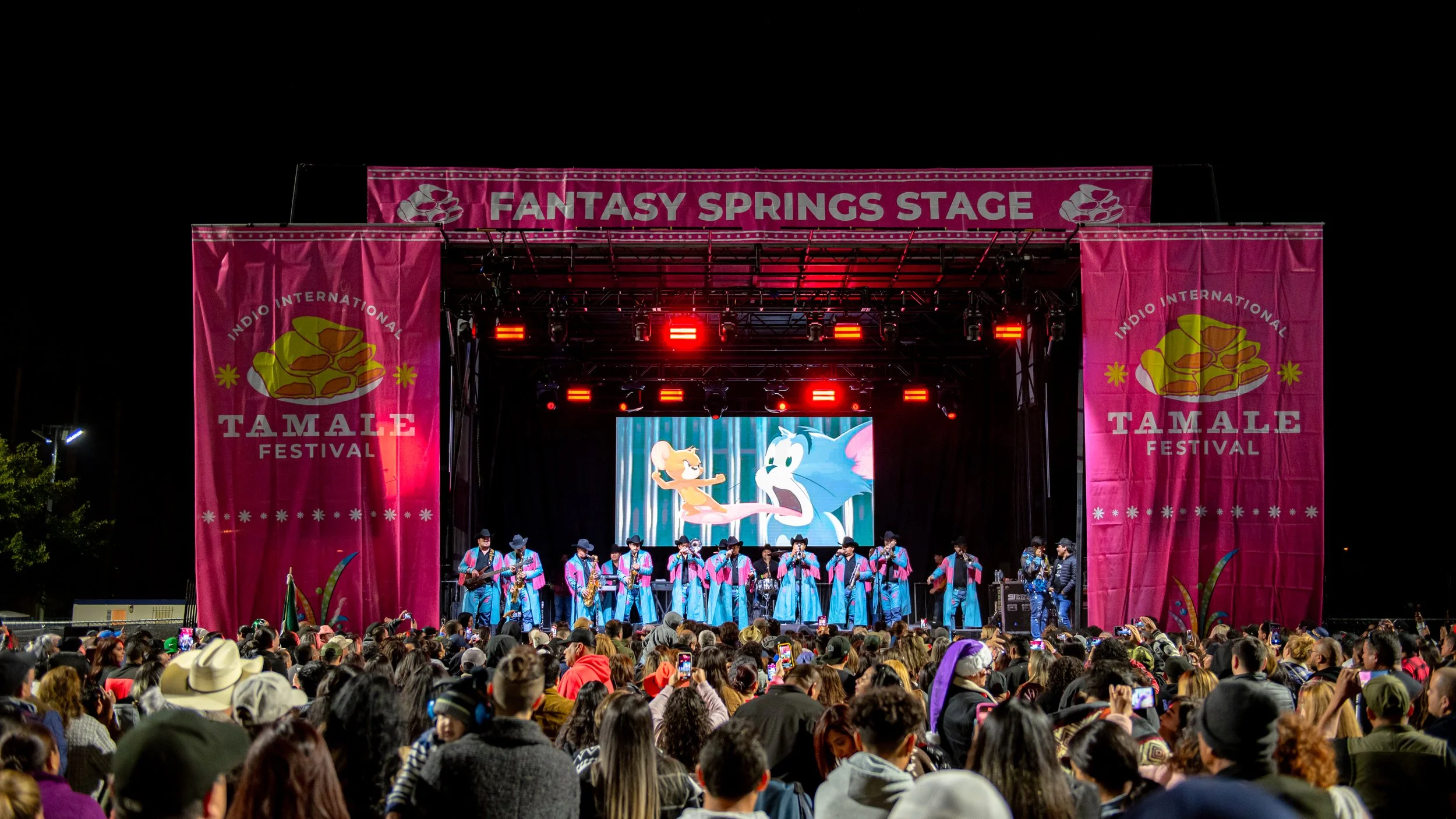
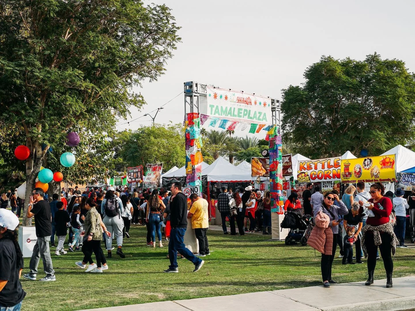
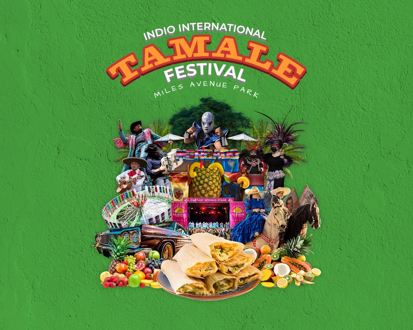
The Indio International Tamale Festival is a City of Indio community event with over 30 years of history, held annually at Miles Avenue Park in the Coachella Valley. One of the largest free cultural festivals in the region, it draws food vendors, live music, entertainment, carnival rides, and thousands of attendees across multiple days each December.
From 2021 to 2023, I served as the primary designer on the festival through CUSP Agency, building its visual identity from scratch and leading all design work across three consecutive years. Every deliverable from the logo system to the festival map was developed through an iterative review process with city and sponsor approval.
VISUAL IDENTITY
BUILT FROM ZERO
With no existing brand system to work from, the 2021 identity started at zero. The logo paired a custom wordmark with an illustrated tamale plate icon, built out in multiple configurations: a primary stacked badge, a horizontal masthead, and single-color variants for versatile application. The color palette drew from Latin American visual culture, anchored by hot pink, teal, mustard yellow, and purple, with a stucco wall texture used as a recurring background element alongside a serape blanket motif. Collage-style photo elements such as lowriders, folklorico dancers, lucha libre figures, tropical fruit, accordions, tamales formed the core visual language of the system, assembled into a signature central composition used across posters and marketing materials.
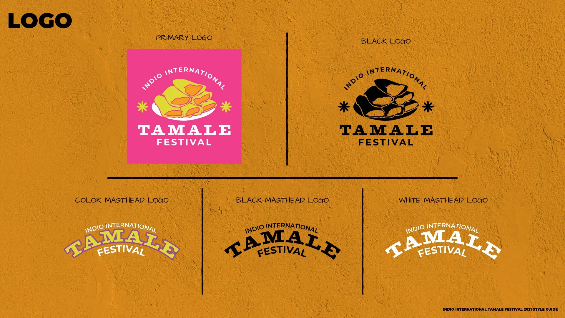
2021 LOGO SYSTEM — PRIMARY, MASTHEAD, AND MONO VARIANTS
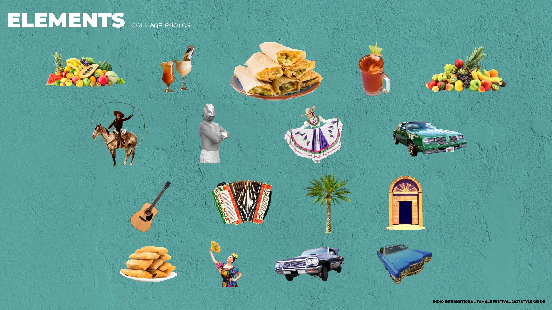
2021 COLLAGE ELEMENT LIBRARY
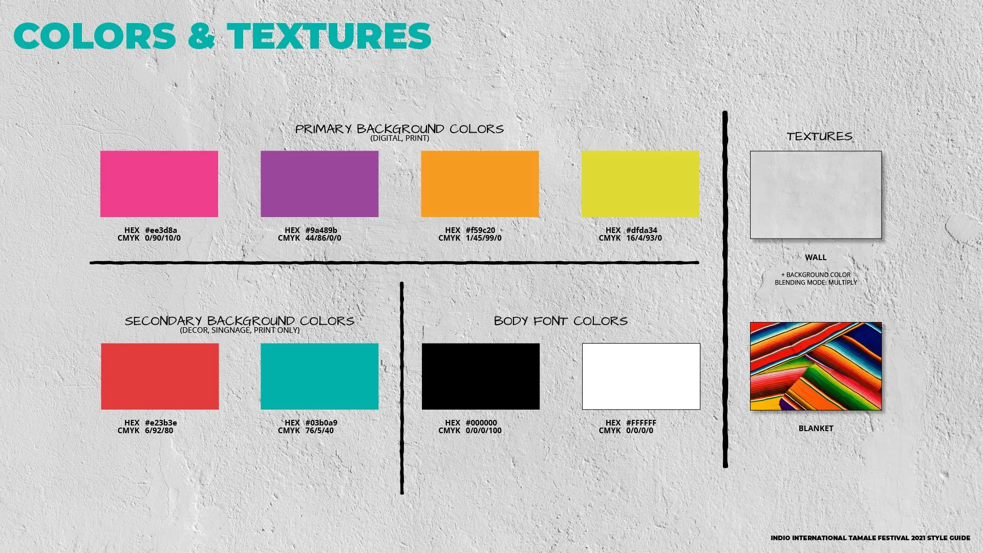
2021 COLOR PALETTE AND TEXTURE SYSTEM
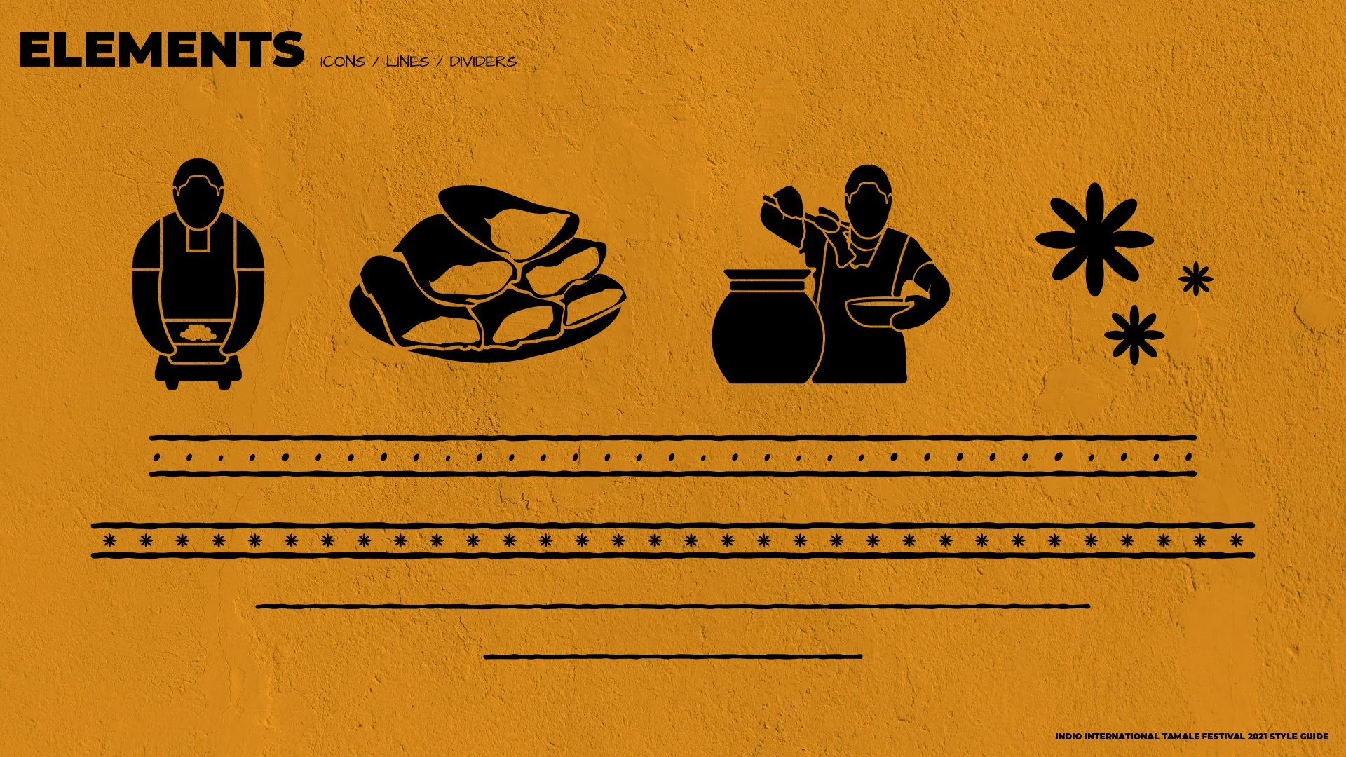
2021 CUSTOM ICONS AND DIVIDER SYSTEM
ANNUAL IDENTITY EVOLUTION
SAME FESTIVAL,
NEW DIRECTION EACH YEAR
Each year received a full identity refresh with a new color direction, updated logo, rebuilt collage composition, and refreshed element library, while keeping the core visual language consistent enough to feel like the same festival.

2021
Established the system. Hot pink, teal, yellow, and purple on stucco, with a flat icon logo and a collage built from stock and cultural imagery.
2021 PRIMARY LOGO
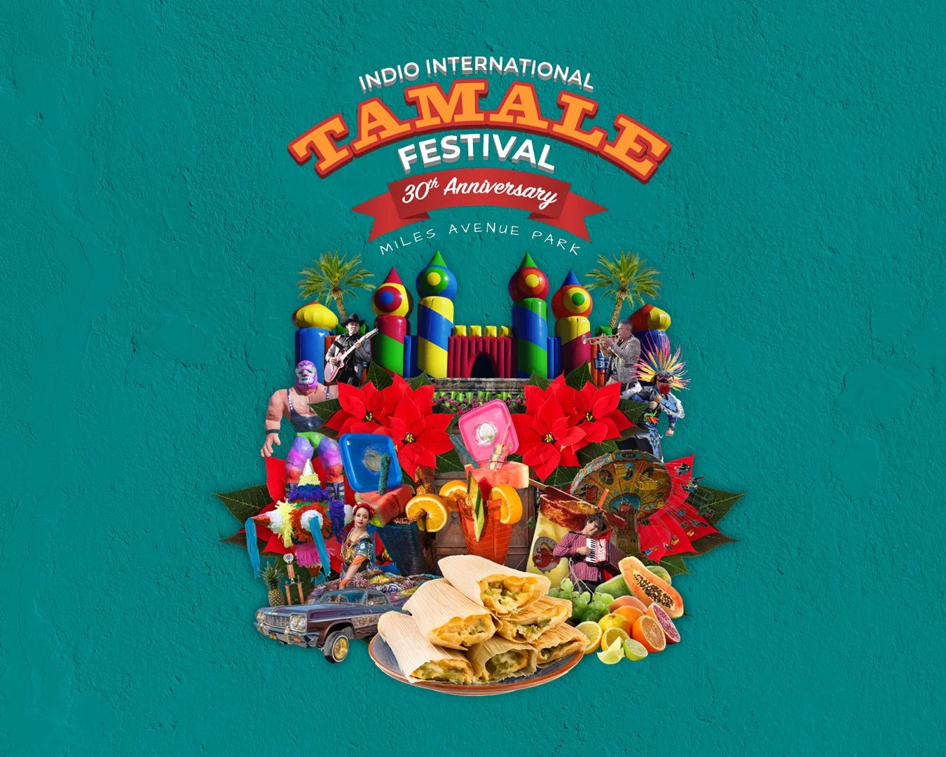
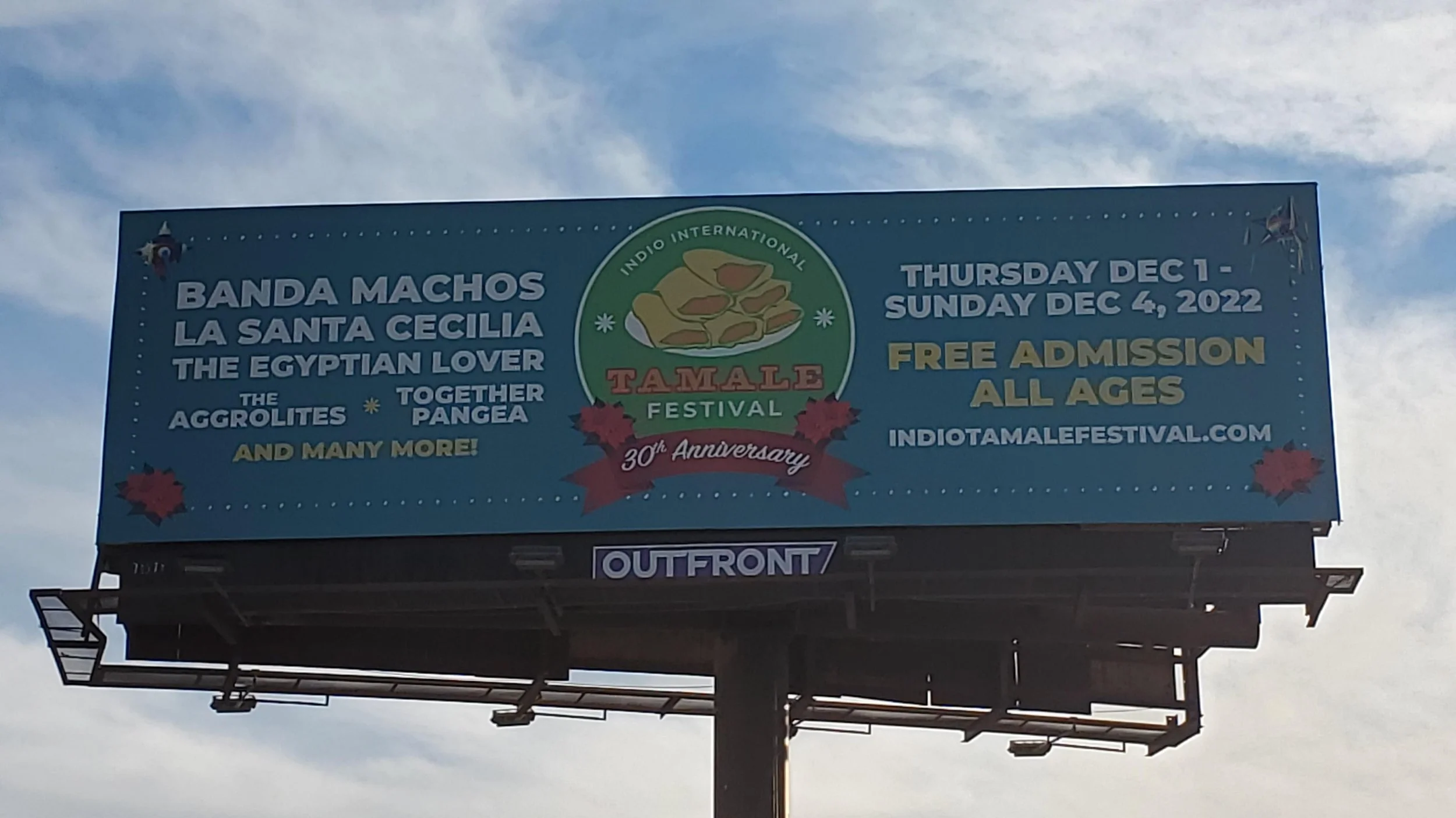
2022: 30TH ANNIVERSARY
Shifted to deep teal, burnt orange, red, and green. The logo included a ribbon and anniversary callout. Poinsettias were introduced.
2022 PRIMARY LOGO - 30TH ANNIVERSARY
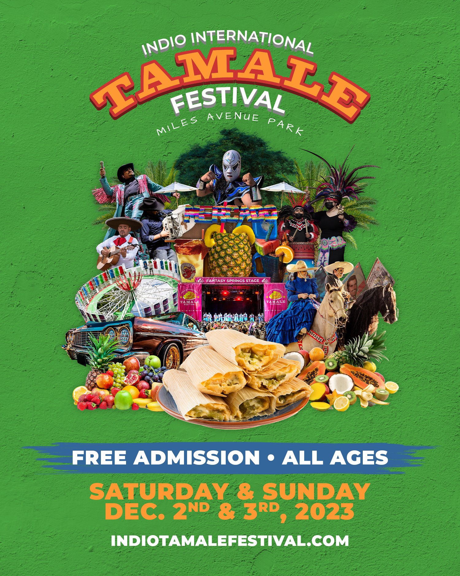
2023
Moved into bold green, blue, and orange. The logo was refined into a cleaner circle badge. The collage incorporated actual photography from past festival events.
2023 PRIMARY LOGO
SUB-BRAND DEVELOPMENT
FESTIVAL ZONES
WITH THEIR OWN IDENTITY
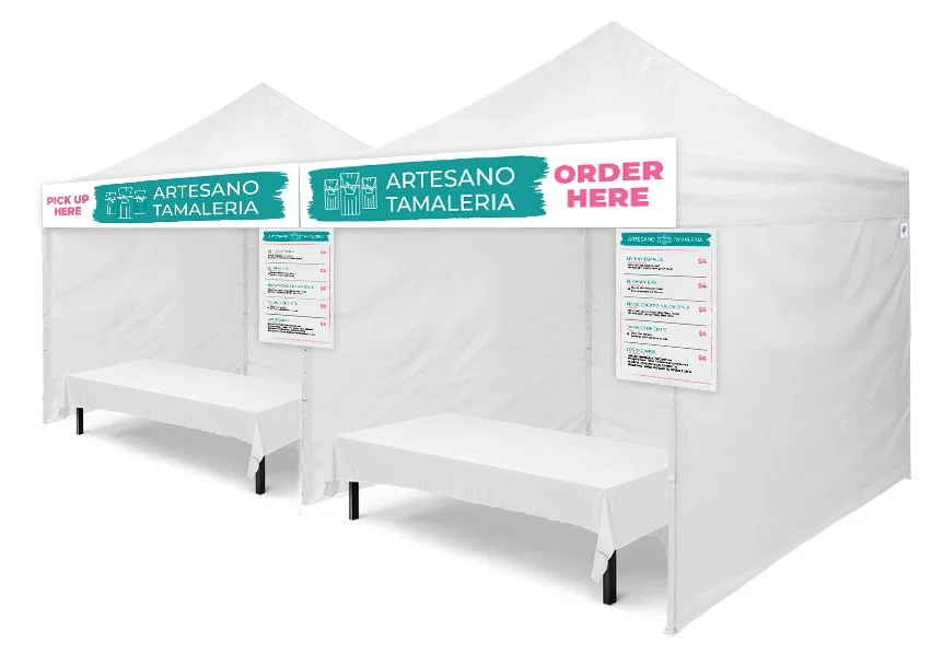
In 2022, two distinct areas within the festival received their own brand identities, each with a full logo suite, color system, typography hierarchy, and element library for use across signage, social media, and print.
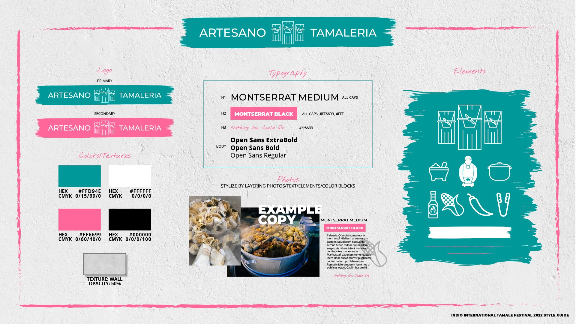
ARTESANO TAMALERIA
A dedicated zone spotlighting artisan tamale vendors. The identity used teal and hot pink with a hand-lettered feel, custom line-art icons of tamale-making tools and figures, and a brush-stroke texture treatment.
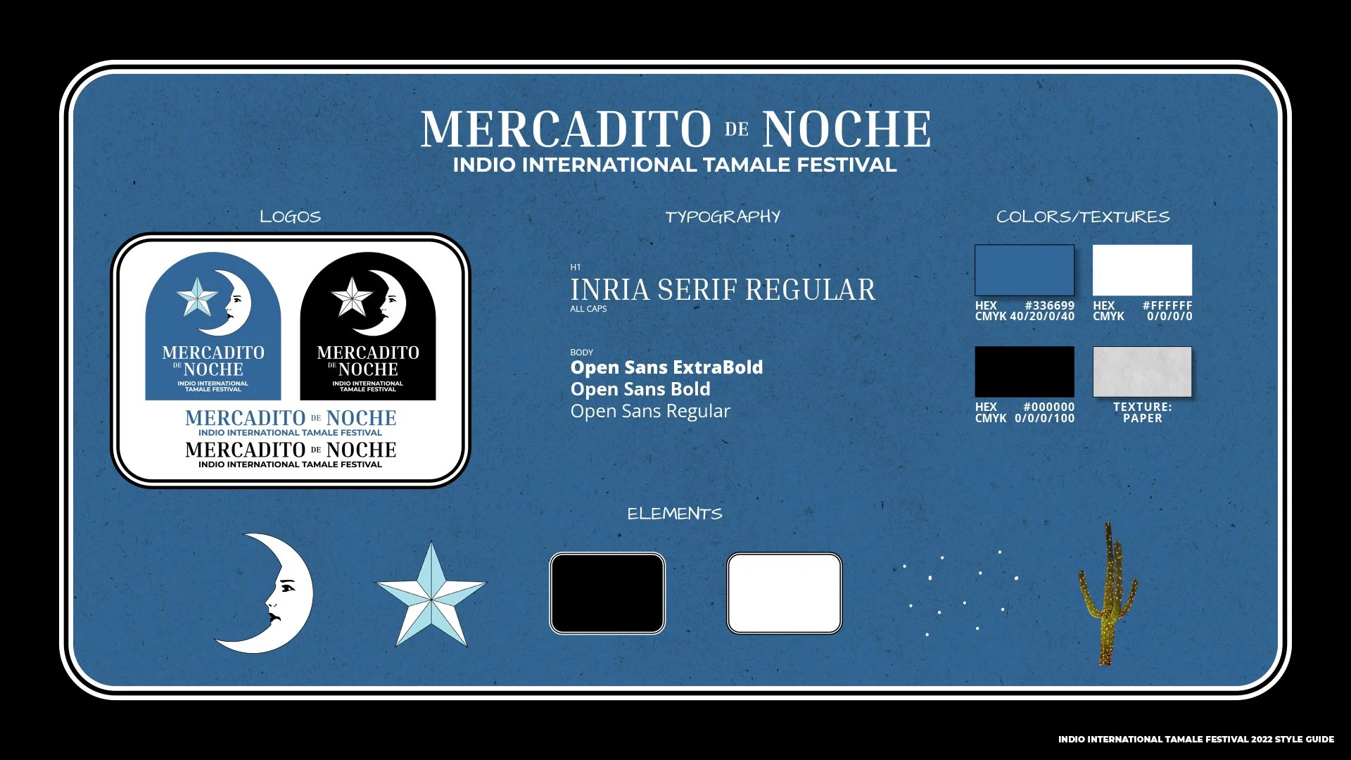
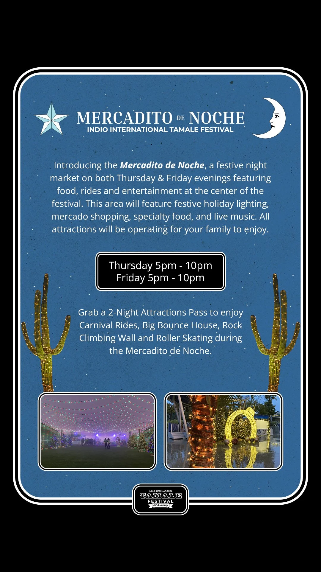
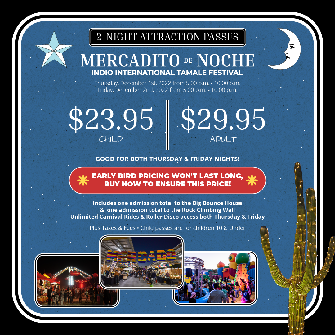
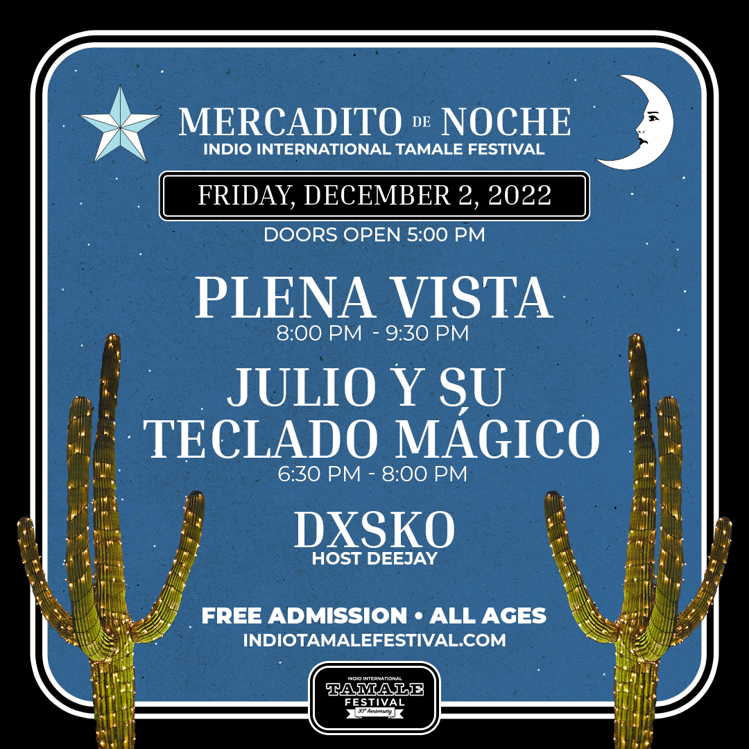
MERCADITO DE NOCHE
The festival's night market featuring live musical performances. The identity leaned into a late-night mood: deep navy, paper texture, white serif typography, and custom elements including a crescent moon, Texas star, and saguaro cactus.
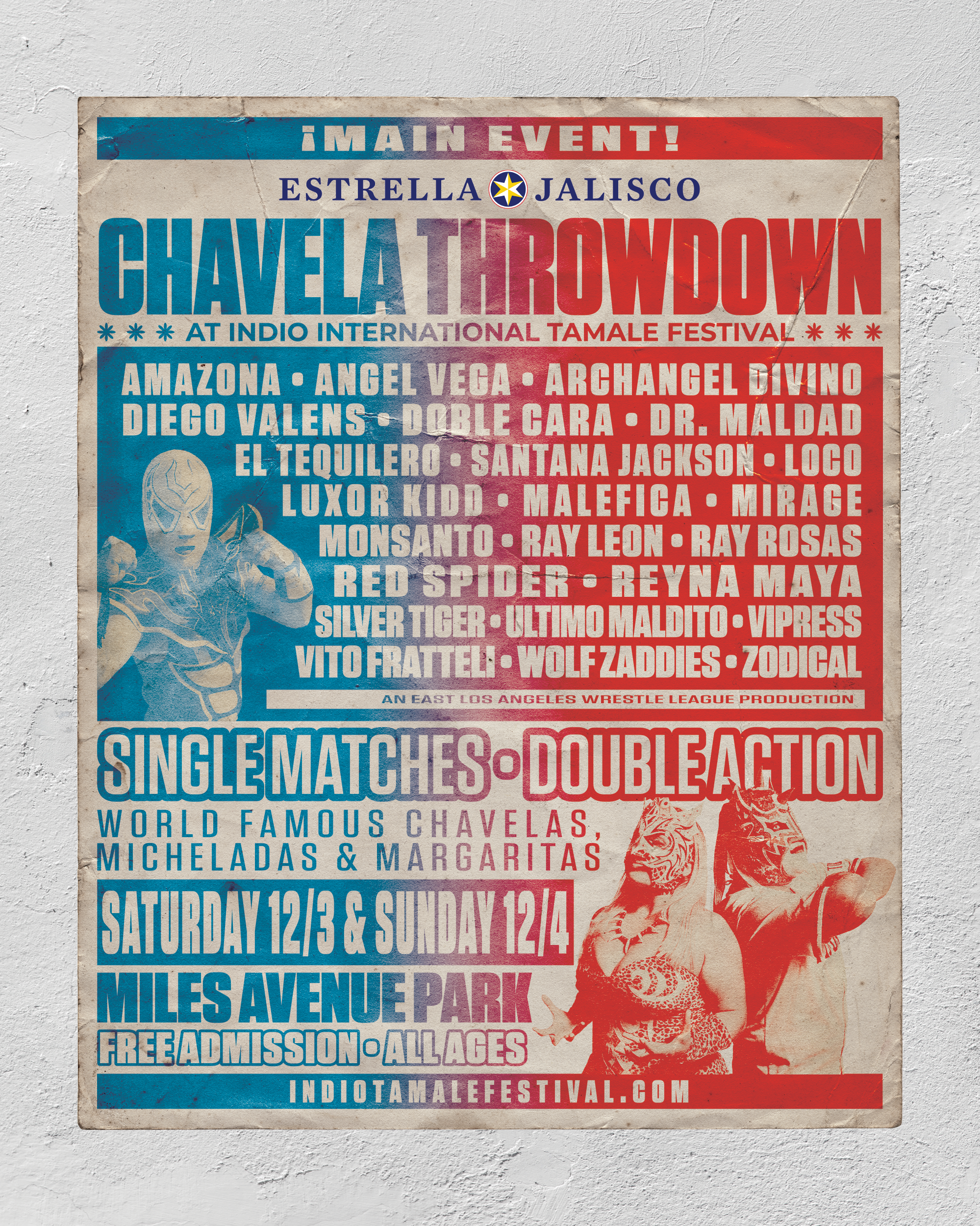
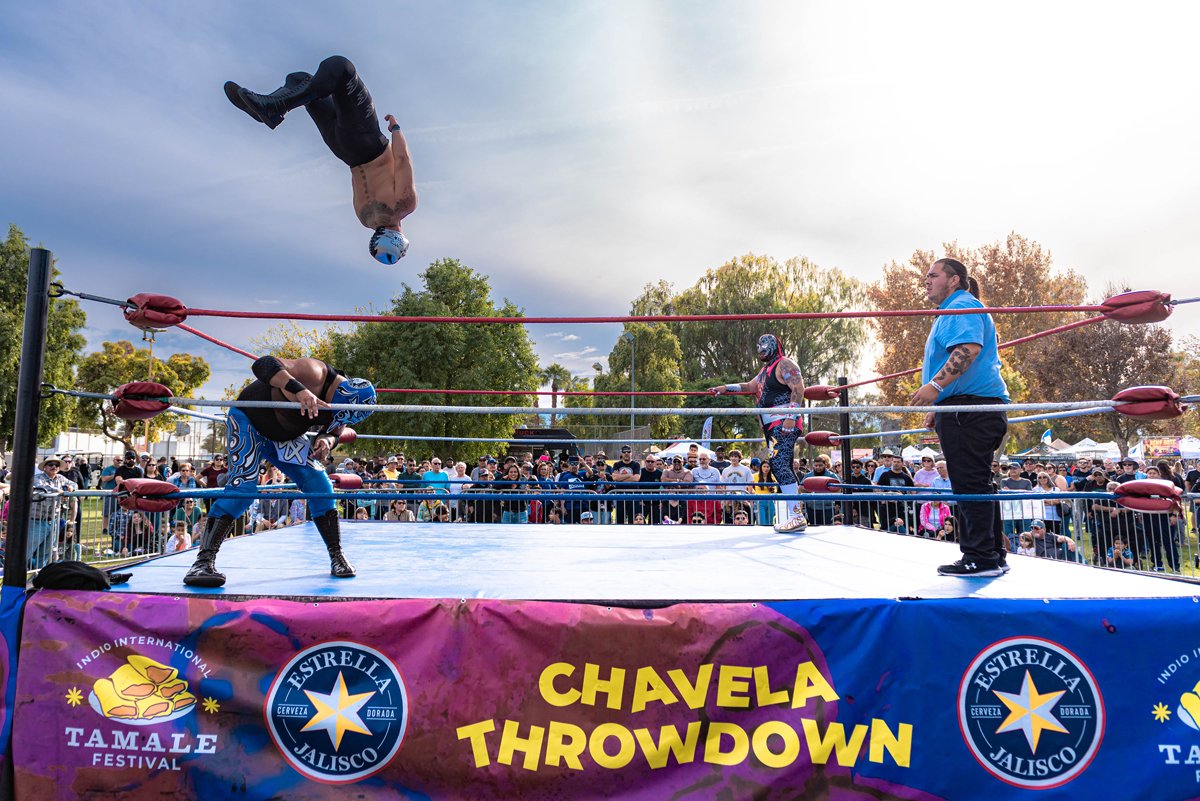
CHAVELA THROWDOWN
LUCHA LIBRE,
THREE YEARS RUNNING
Chavela Throwdown was a lucha libre event hosted within the festival each year, sponsored by Estrella Jalisco. I designed the zone's environmental elements across all three years, including ring banners and menus, with the ring banners drawing from the main festival identity system. For 2022 and 2023, I also designed the event poster, intentionally breaking from the festival's visual language with worn textures, distinct typography, and a fight-card aesthetic rooted in authentic lucha libre print traditions, with Estrella Jalisco branding integrated throughout.

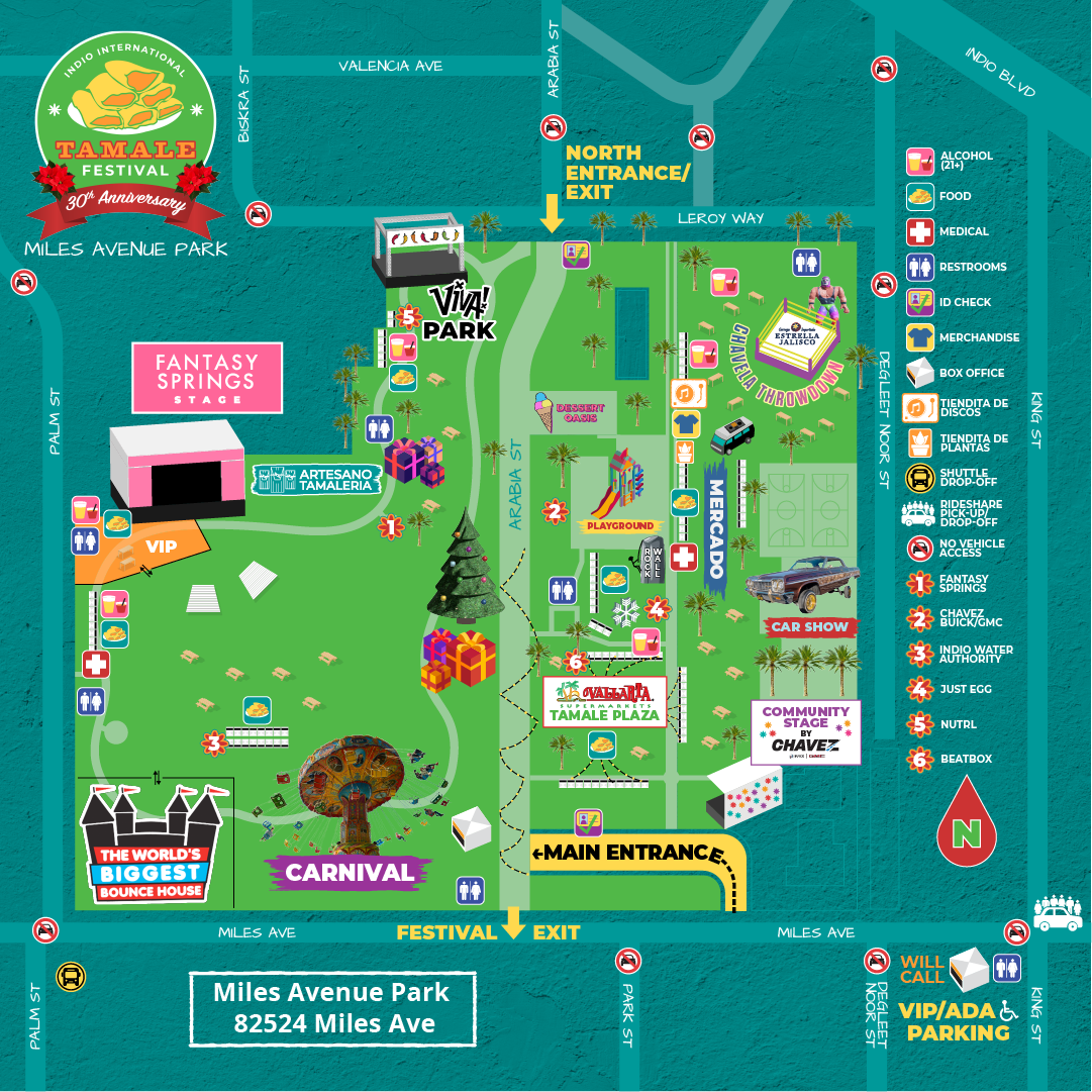
FESTIVAL MAP AND WAYFINDING
FINDING YOUR WAY
THROUGH THE FESTIVAL
A festival map was produced each year showing the grounds layout at Miles Avenue Park, including stages, vendor areas, parking, shuttle and rideshare drop-off, and points of interest. The map was adapted for multiple uses: printed as large-format signage installed on-site for attendee wayfinding, and formatted for social media distribution. Sponsor logos and branded zones were integrated into the map design where applicable.
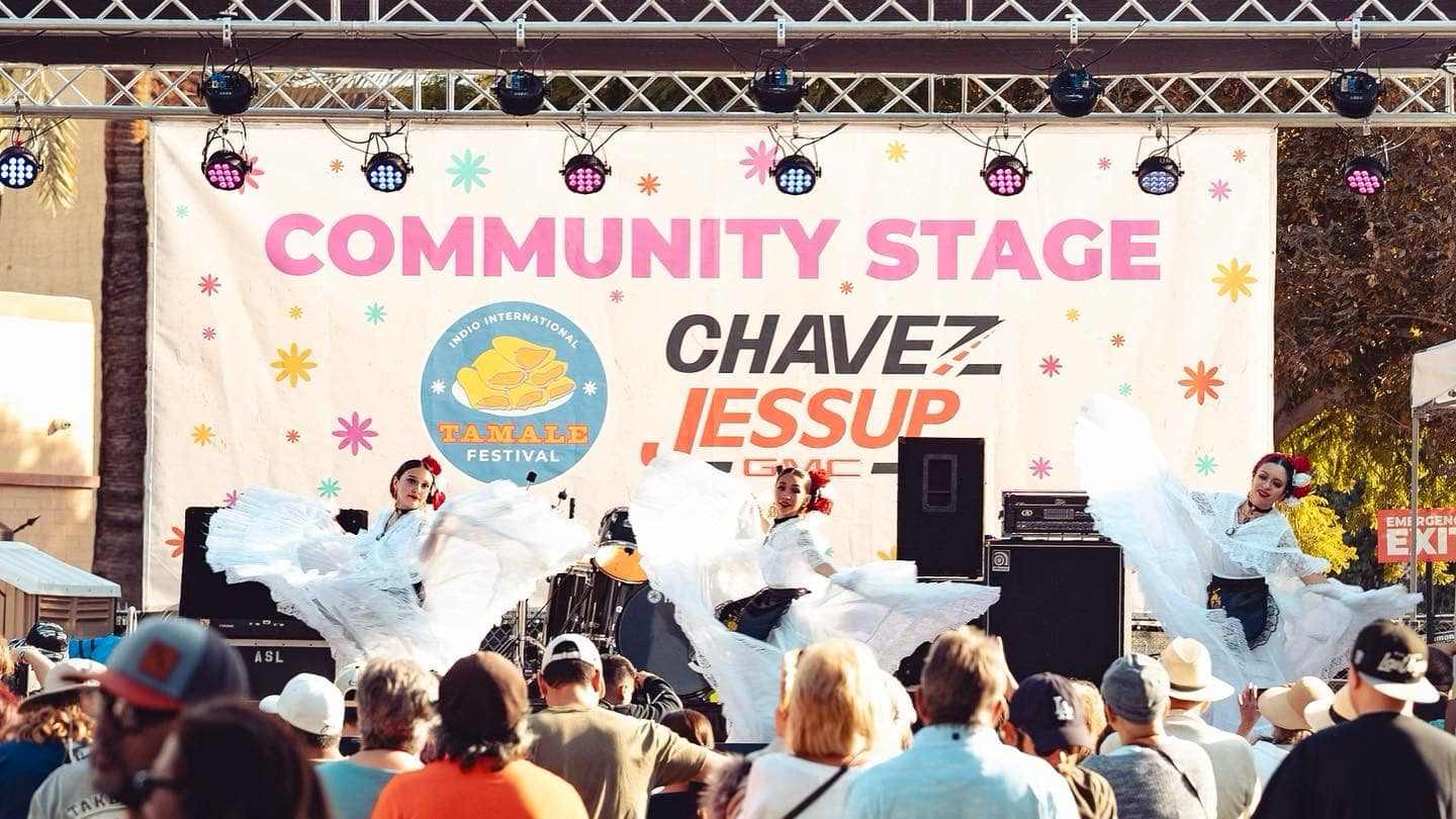
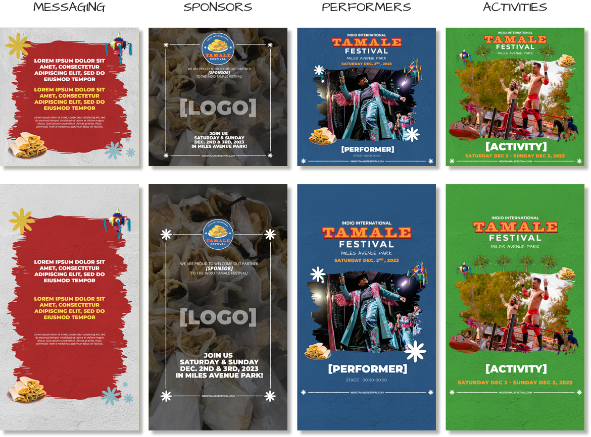
MARKETING AND SOCIAL TEMPLATES
EVERY FORMAT,
EVERY CHANNEL
The full marketing package each year included the main event poster, out-of-home advertising (including billboards), and a social media template system covering performer announcements, sponsor callouts, activity highlights, and general messaging posts. Templates were built for both square and story formats and handed off for use by the broader CUSP team. Additional deliverables included credentials and event signage using the festival brand system.

SCOPE OF WORK
Style Guide Sub-brand Development
Poster Design Out-of-home Advertising
Fesitval Map Environmental Signage
Social Media Templates Credentials
Annual Brand Refresh Sponsor Asset Integration