camp
flog
gnaw
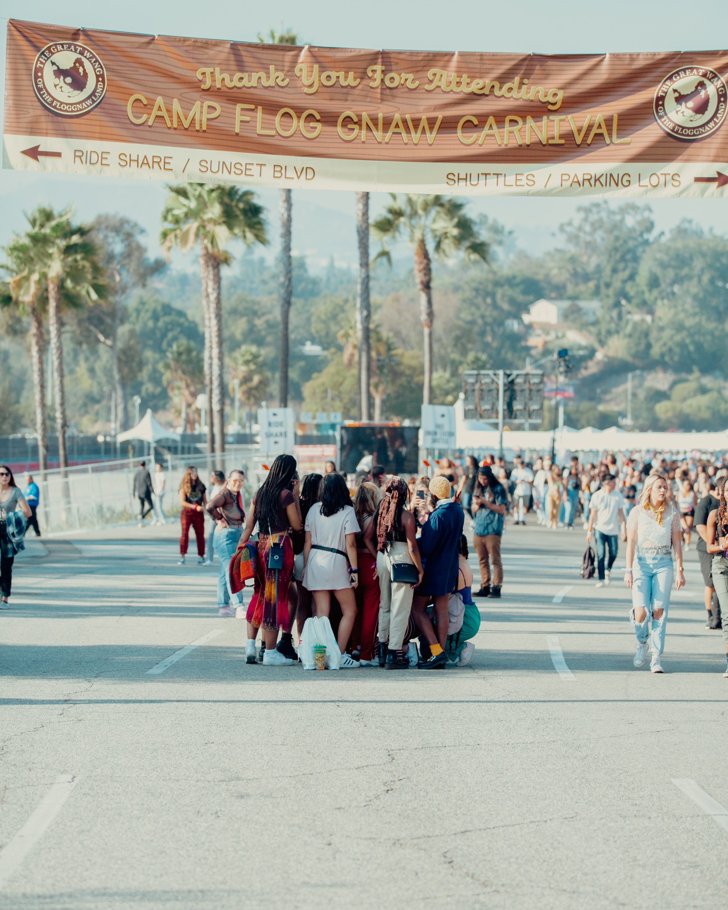
carnival
GOLDENVOICE / AEG PRESENTS · 2016–2019
Environmental Design, Illustrated Graphics, Brand Stewardship
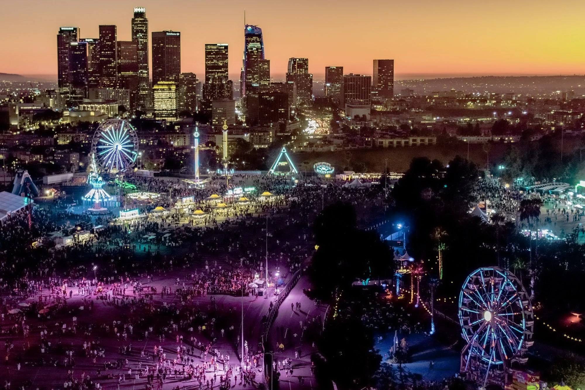
Tyler, the Creator's annual festival at Dodger Stadium.
CONTEXT
Extending a strong brand identity demands as much creative judgment as building one
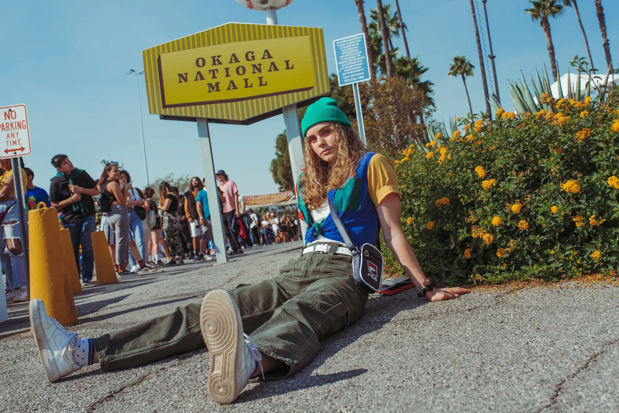
Camp Flog Gnaw is Tyler, the Creator's annual festival, held at Exposition Park in 2016 and 2017, then Dodger Stadium from 2018 onward. It has a distinct and specific visual identity: playful, irreverent, and instantly recognizable. Working within it required a different discipline than building a brand system from the ground up. The job was to extend and support what already existed, not reinterpret it.
I supported the festival from 2016 to 2019 alongside Tyler's creative team and the internal Goldenvoice festival team, handling a high volume of design needs across signage, event materials, printed guides, and custom illustrated graphics.
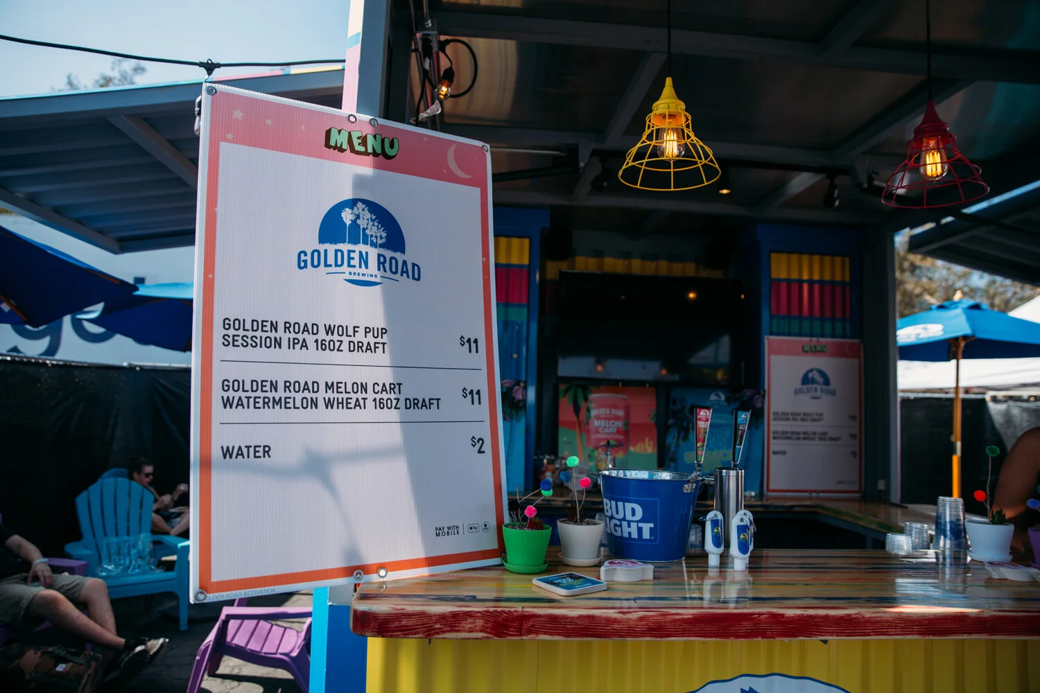
ENVIRONMENTAL SIGNAGE
A venue-wide system, built under pressure
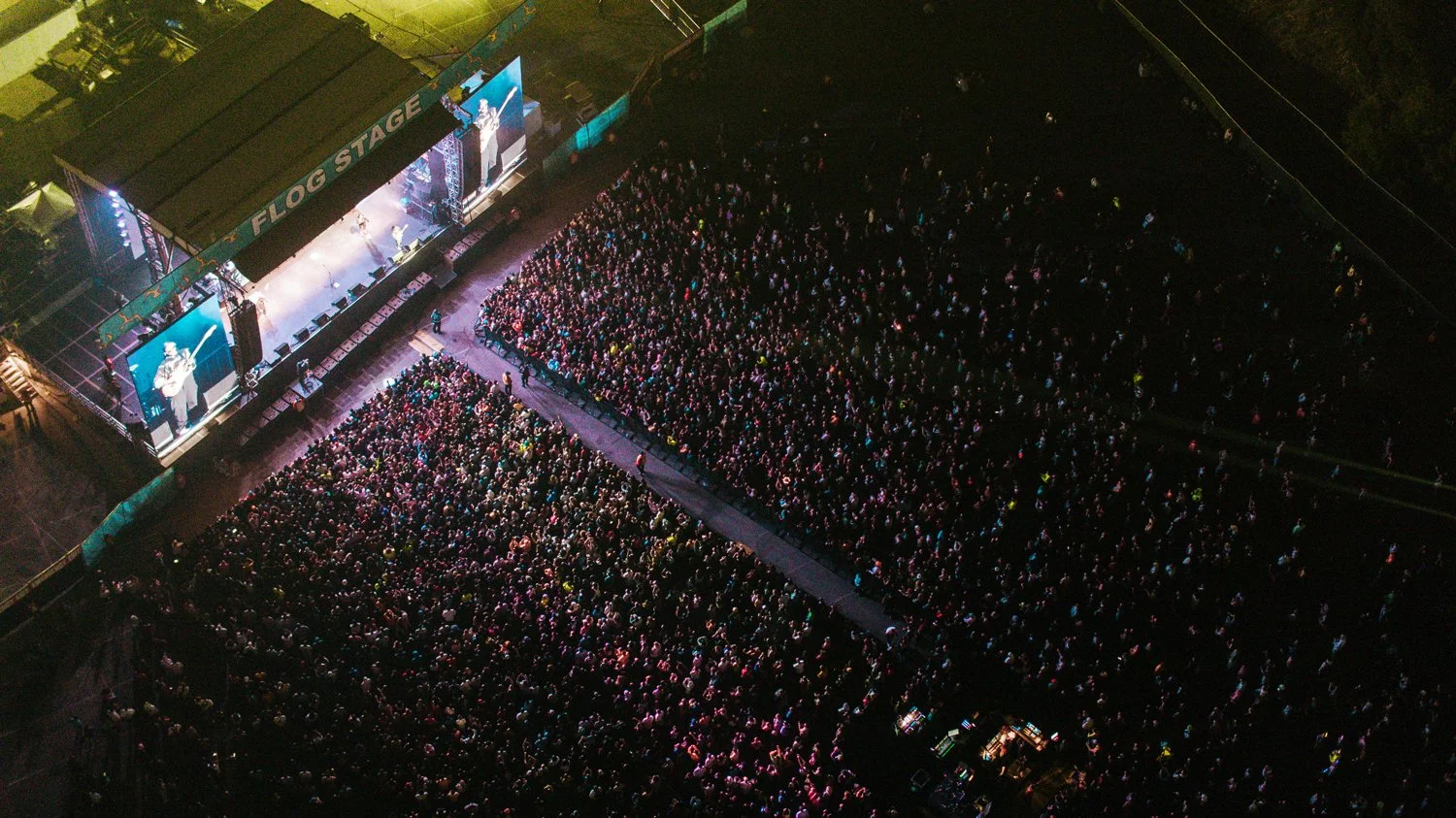
Neither Exposition Park nor Dodger Stadium is a purpose-built festival venue. Each year, Camp Flog Gnaw required a signage system that could orient tens of thousands of people through a converted space: wayfinding, stage identification, zone markers, sponsor integrations, and back-of-house operational signage all running simultaneously.
The volume was real. Across four years and two venues I produced a high number of distinct signage pieces spanning multiple formats, scales, and installation contexts. The work was template-driven and production-focused, built for consistency and speed. When departments needed files fast, it either held together or it didn't.

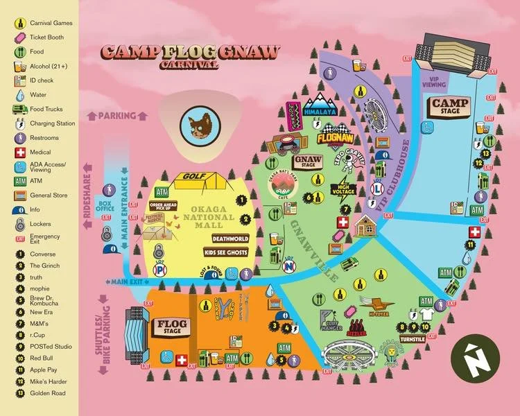
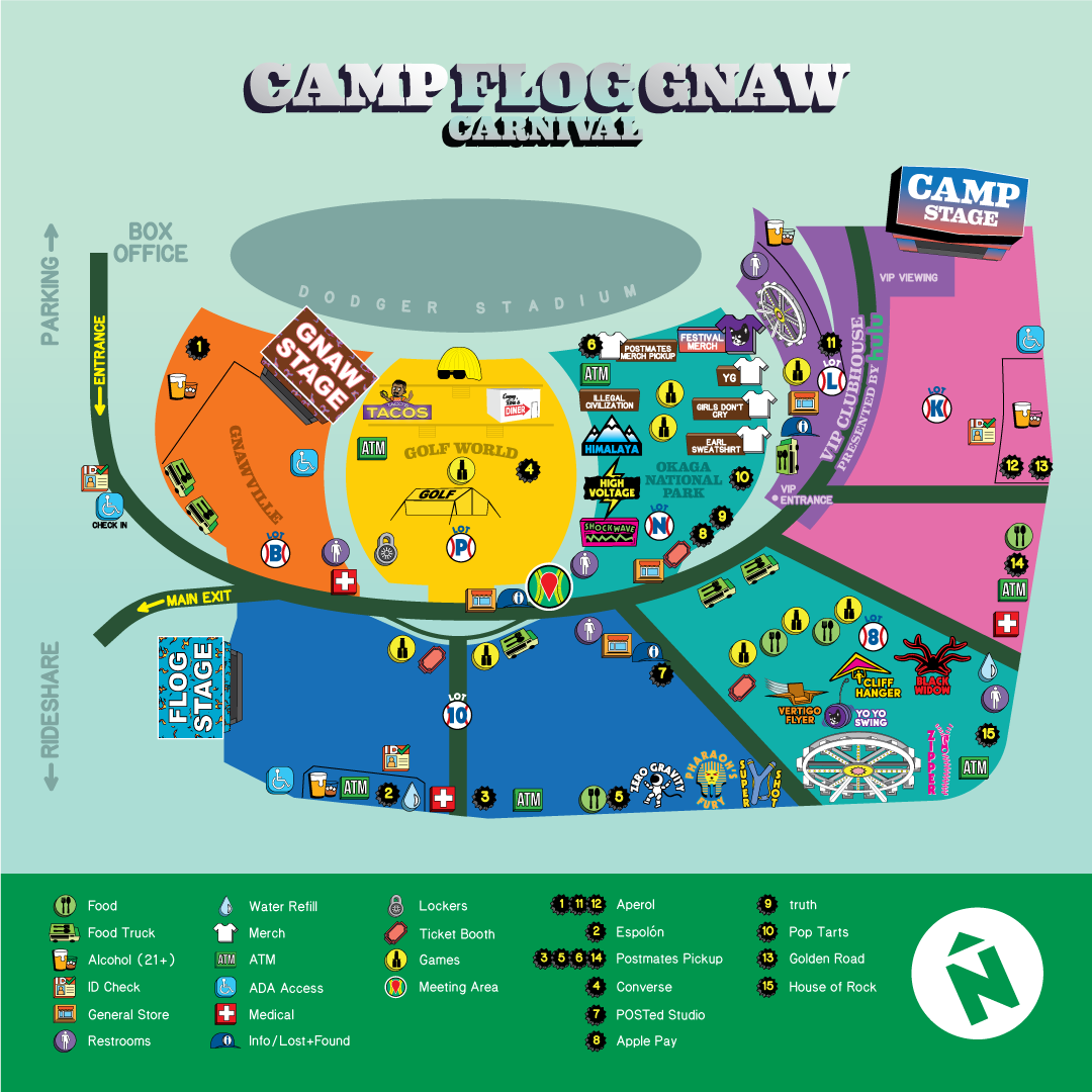
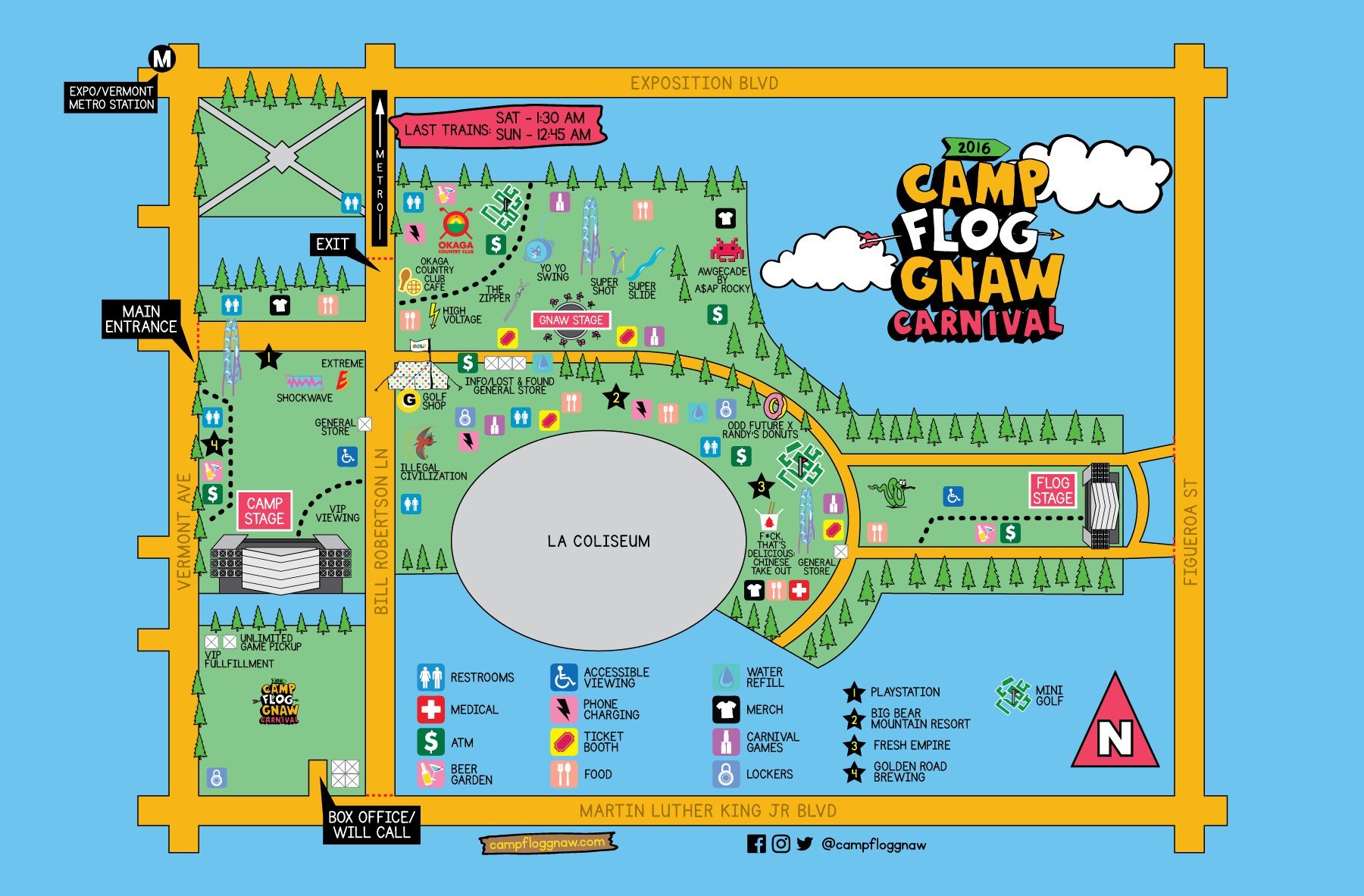
ILLUSTRATED MAPS
Wayfinding that belongs in the world Tyler built
The illustrated maps I contributed were grounded in the specific character of the event. Wayfinding at Camp Flog Gnaw had to feel like it belonged in the world Tyler built, designed and illustrated to match that sensibility while remaining functional for tens of thousands of people navigating a converted venue.
Maintaining brand consistency under production pressure is a real and underappreciated skill. When timelines compress and vendors need files immediately, the work either holds together or it does not.
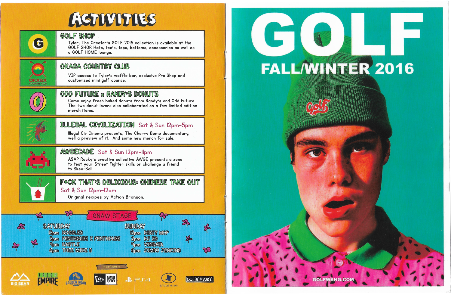
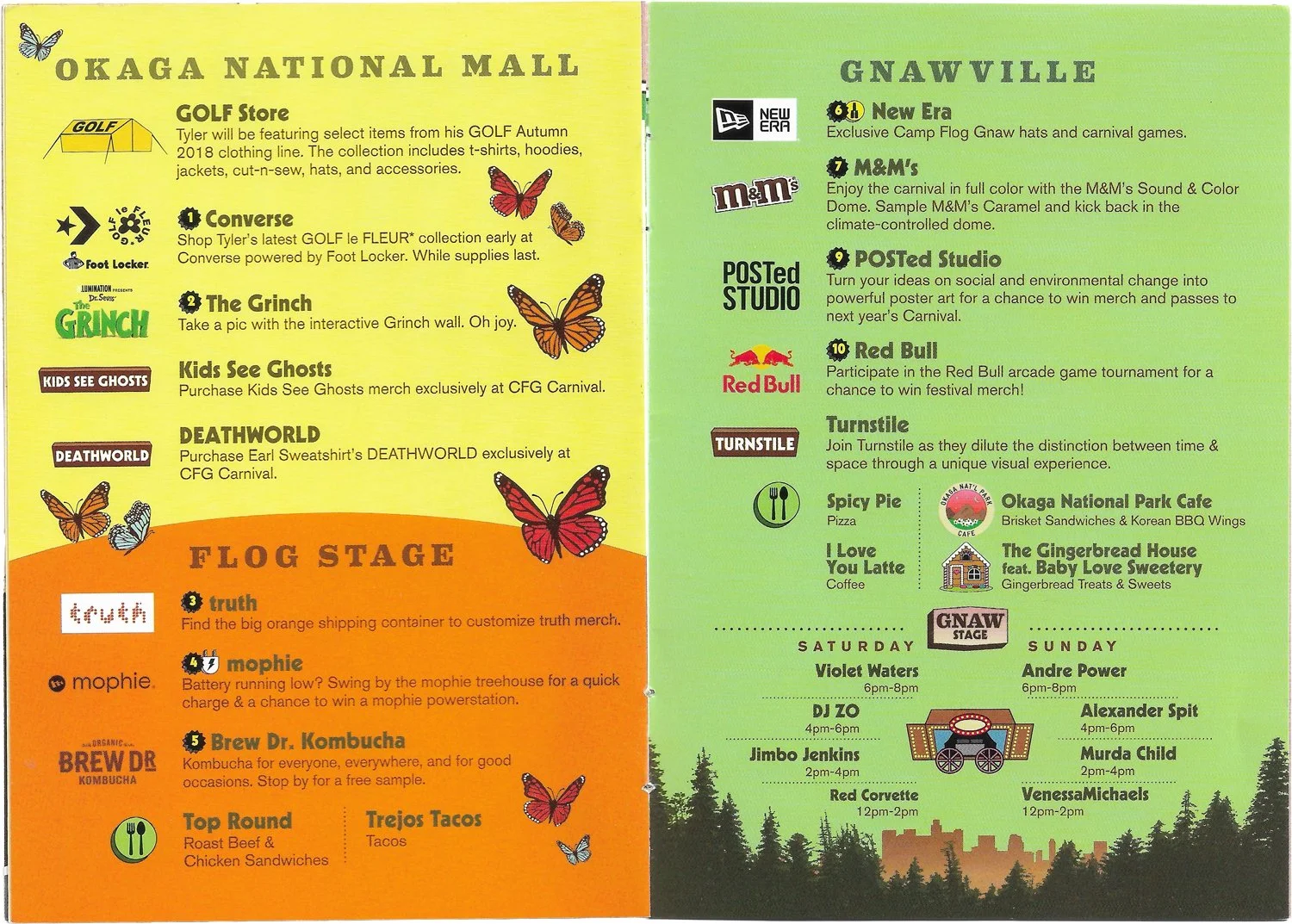
DAY-OF GUIDES
A printed guide that lives inside the event
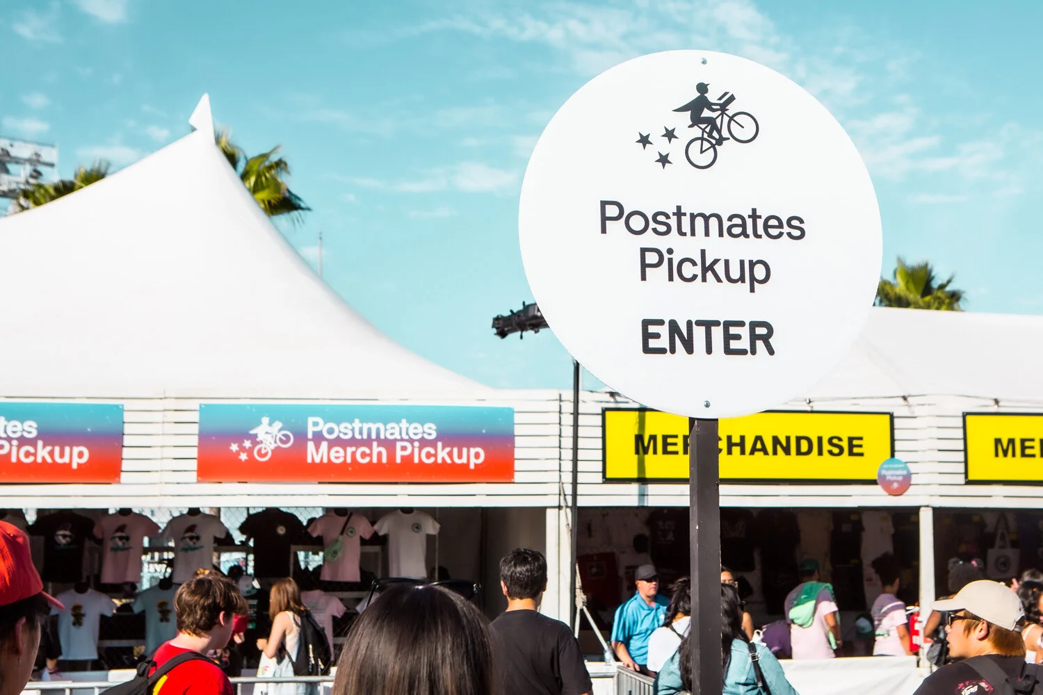
Each year I designed a printed day-of guide distributed to attendees at the festival, a compact pamphlet covering lineup, set times, maps, and essential venue information. The guides also included advertising for Golf Wang and Tyler-adjacent brands, which meant the layout had to carry both editorial and commercial content without losing the Camp Flog Gnaw voice.
Print design for a live event is specific. The guide gets used in a crowd, in partial daylight, by someone who has a few seconds to find what they need. Hierarchy, legibility, and personality all have to work at once, inside a tight brand language, with ad placements to accommodate.

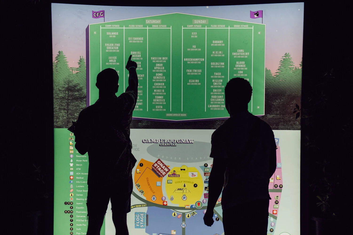
SET TIMES
Rather than a standard grid format, the set time graphics used Dodger Stadium's scoreboard as the visual reference, mapping two stages onto the actual geometry.
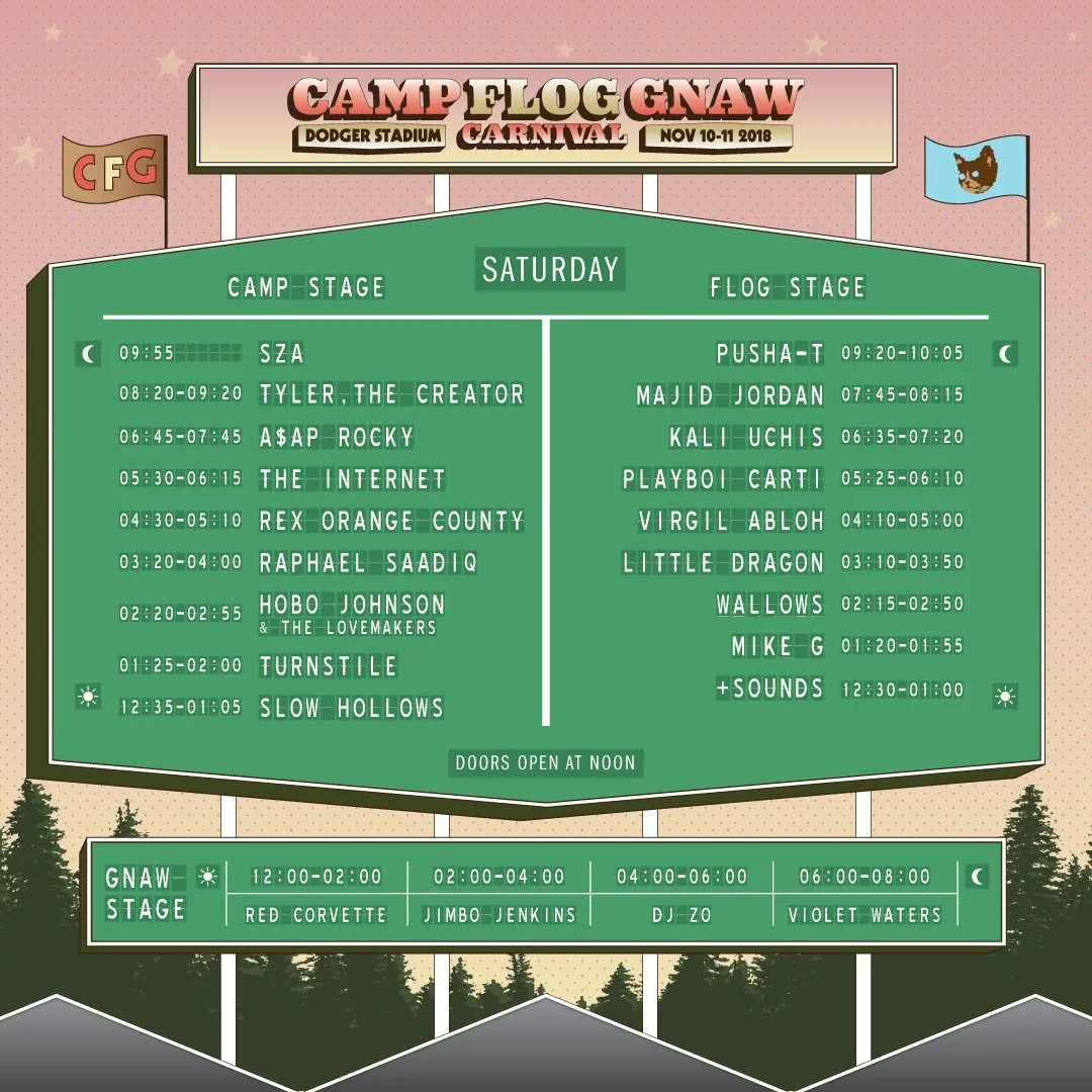
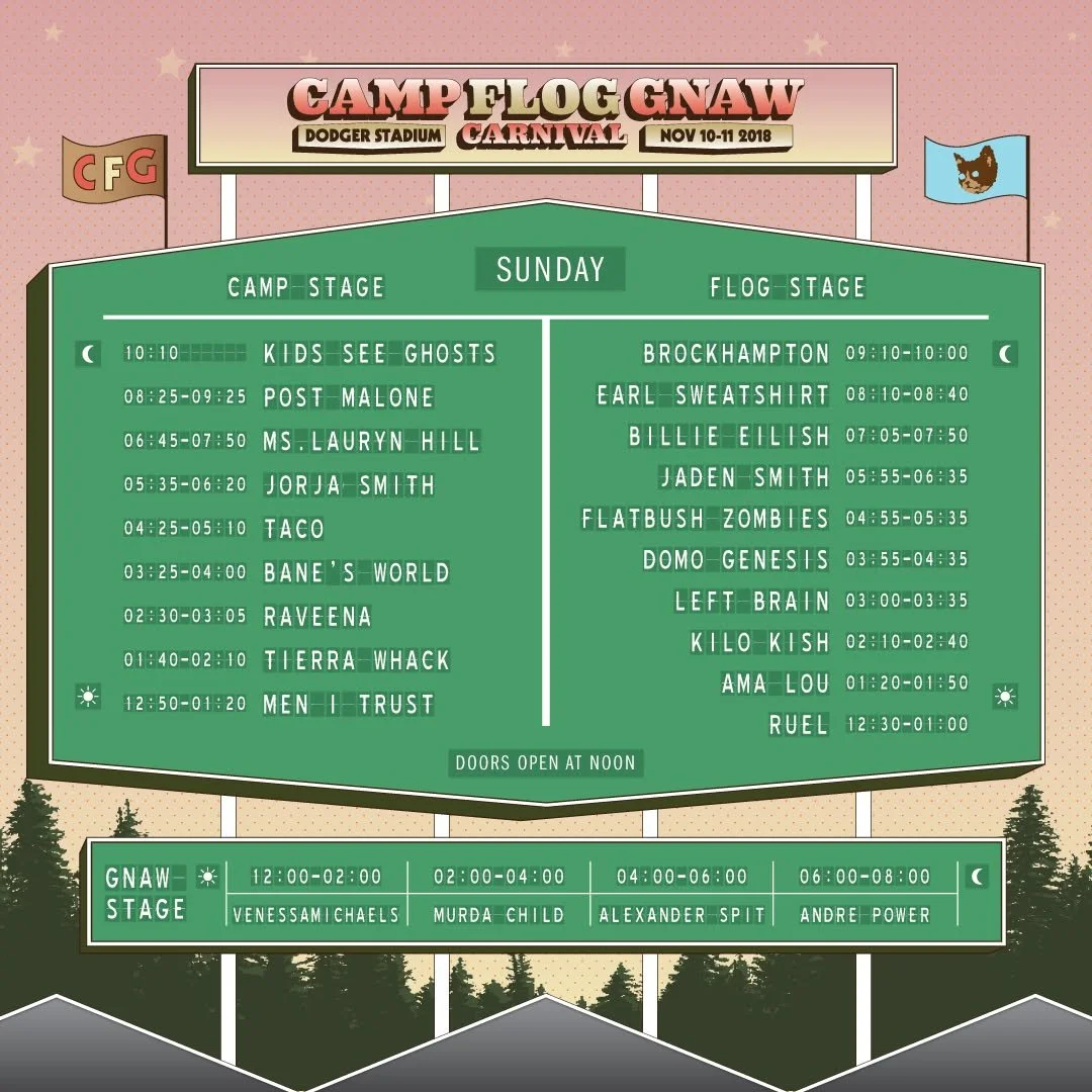
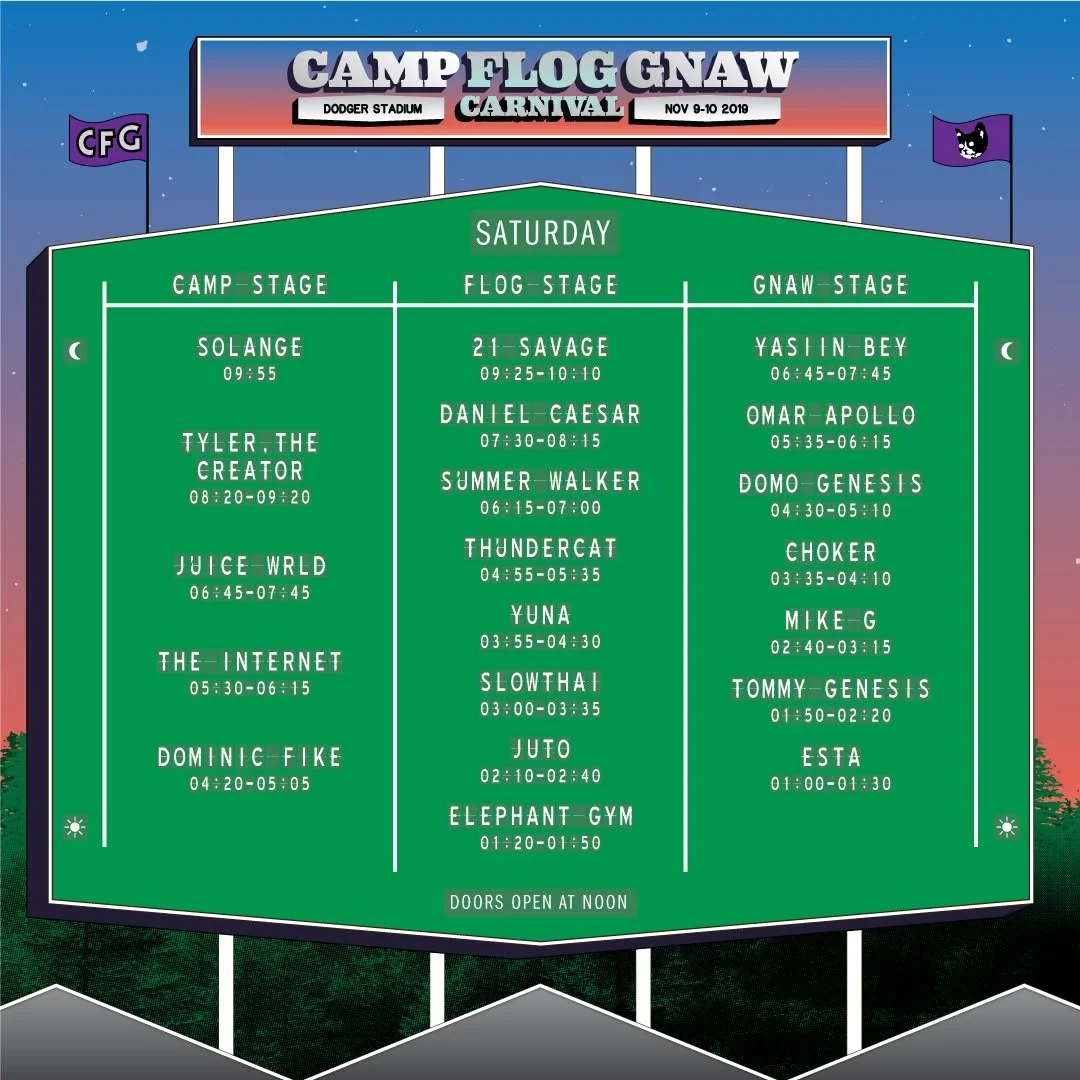
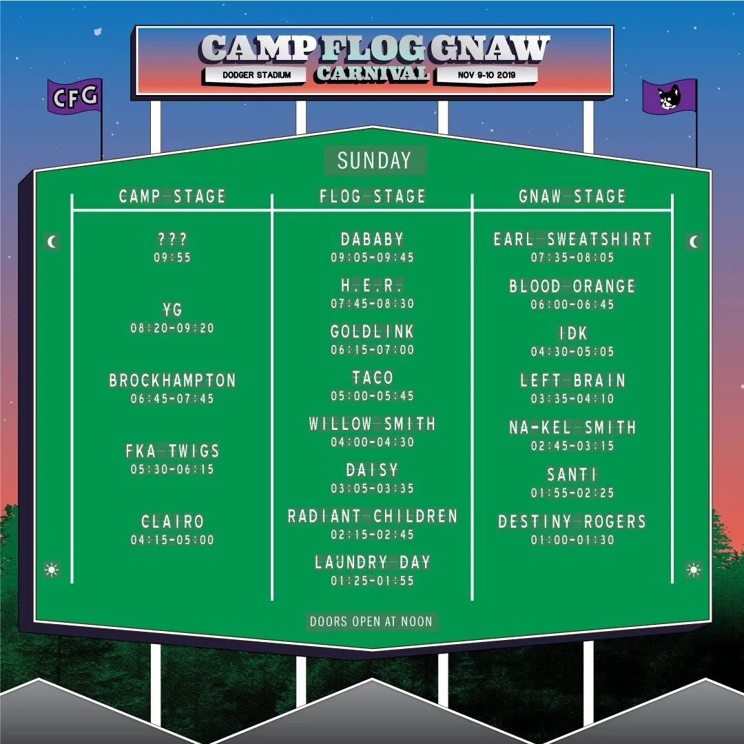
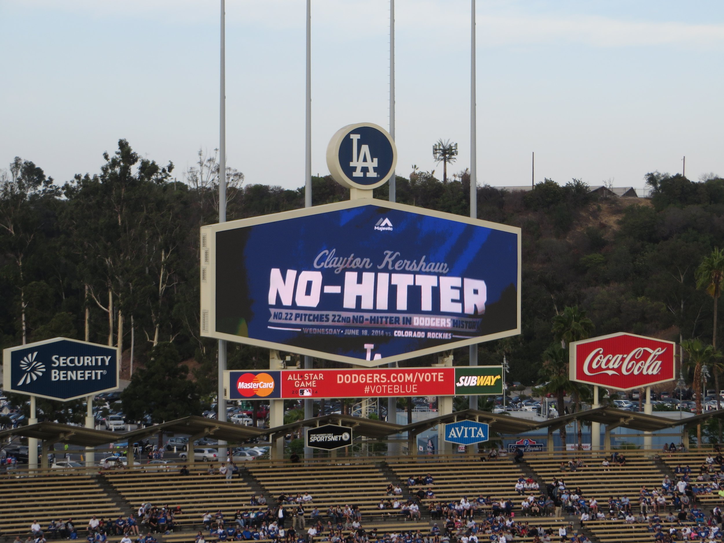
Photo by Ken Lund
SCOPE OF WORK
Stage Branding Illustrated Maps
Set Times Graphics Day-of Print Guides
Editorial & aAd Layout Spacial Graphic Design
Brand Identity Extention Large-format Production Files
Vendor-Ready Artwork